Client
West Lafayette, Indiana
Collaborators
Technical Direction: Richard Dionne
Lighting Design: Daniel Taylor
Costume Design: Brian Butler
Sound Design/Composition: Jing Zhao
David Lindsay-Abaire’s Rabbit Hole explores the many faces of grief.
David Lindsay-Abaire’s Rabbit Hole explores the many faces of grief. Heartbreaking, yet sometimes wildly funny, this play is typically rendered with some degree of realism when it comes to scenography. Much of the play takes place in the kitchen and living room of Becca, our protagonist. Going into my initial conversations with the director, I planned on creating a realistic, upper middle-class home on Purdue’s stage. I was excited by the challenge of realism and was planning on delving into as many details as possible.
My blue sky thoughts included using archways upstage to give the audience a glimpse of a formal dining room or other unutilized rooms in the home. Overall, I came into the project wanting the scenery to give the world a sense of depth, establish the socio-economic reality of the characters and contrast the sadness of Becca with a veneer of civility on suburban ‘niceness’.
That all was wiped away within the first moments of that initial production meeting. Caity, our director, wanted to lean into the avant-garde. She planned on including movement based interludes and was drawn to the dissonate works of composer Phillip Glass. She wanted to explore the cosmic concept of a ‘Rabbit Hole’ (Black or Worm Hole) and alternate realities. The director was also interested in using projections, especially in the movement pieces. I was excited by this fresh take on the play, yet was still interested in ways to incorporate slices of realism.
Initial Sketches
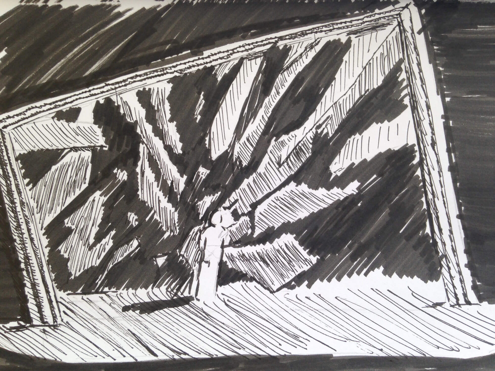
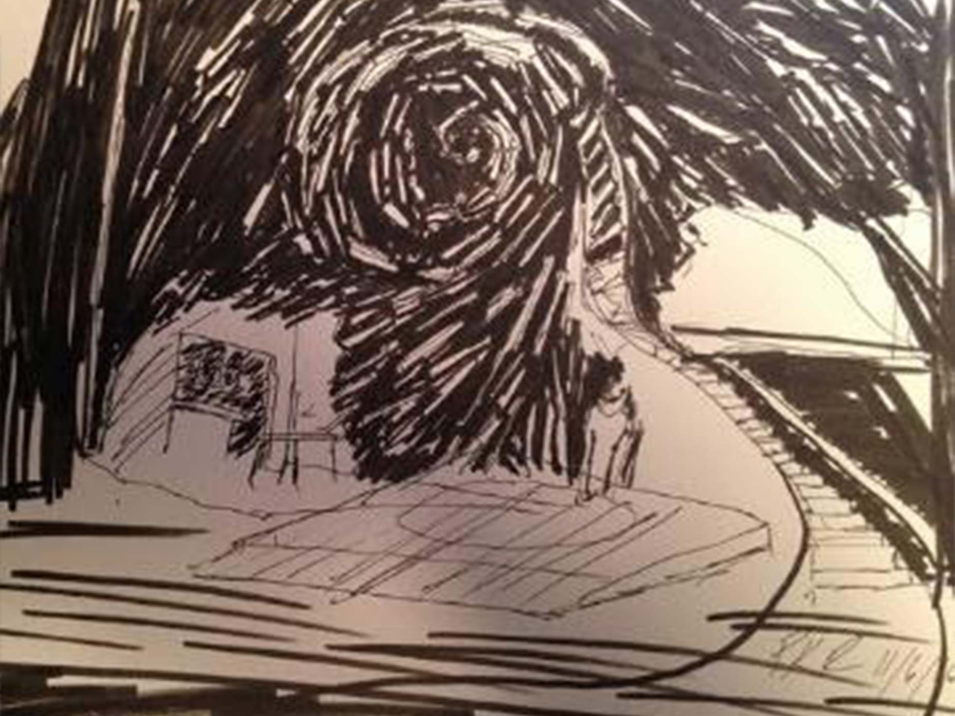
My initial sketch leaned heavily on the concept of projections and Becca’s ‘shattered’ world. I envisioned a false proscenium of a picture frame that had been shattered. Upstage shards of broken glass would float above the performers and act as projection surfaces.
In the same meeting I presented a sketch that had a spiral staircase disintegrating into a chaotic vortex. The scenery was being pulled into an upstage ‘Rabbit Hole’. The director reacted strongly to the spiral imagery and that, ultimately, became a strong touchstone for the design.
Establishing Design

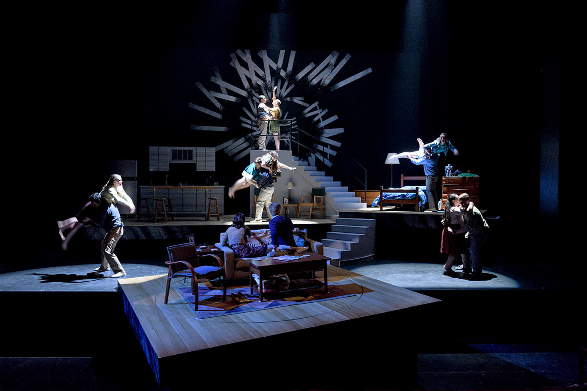
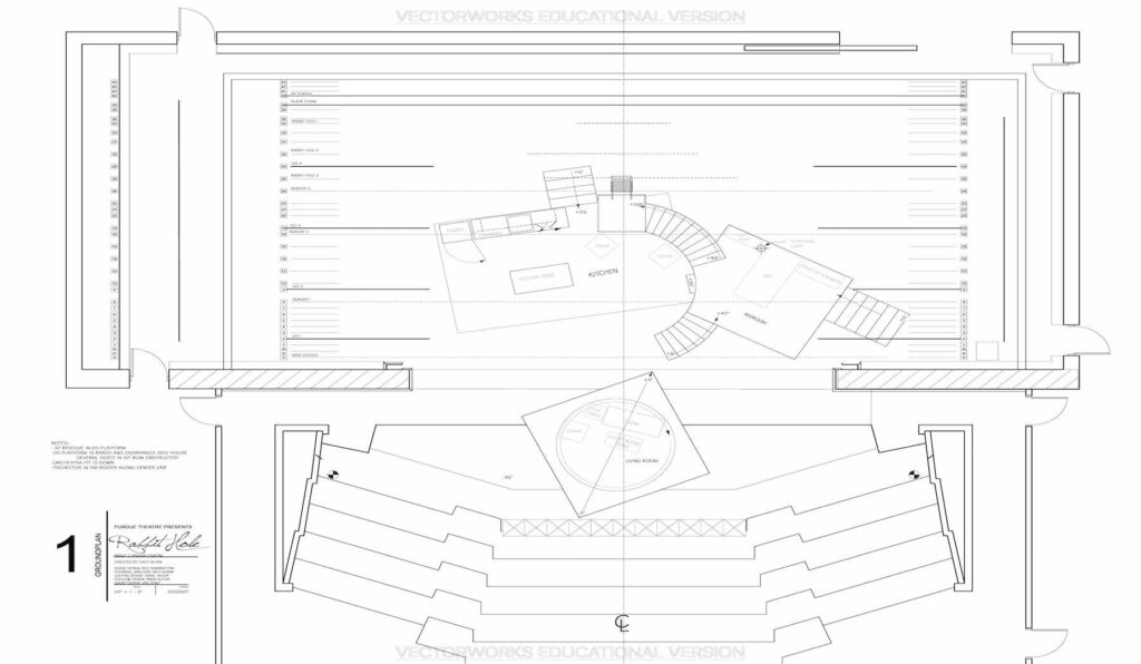
Isolation became an important feature of the design as we began to establish the overall design. I designed four locations (living room, bedroom, kitchen and staircase) and sought to make them appear isolated from each other while also keeping a relatively easy flow from for performers.
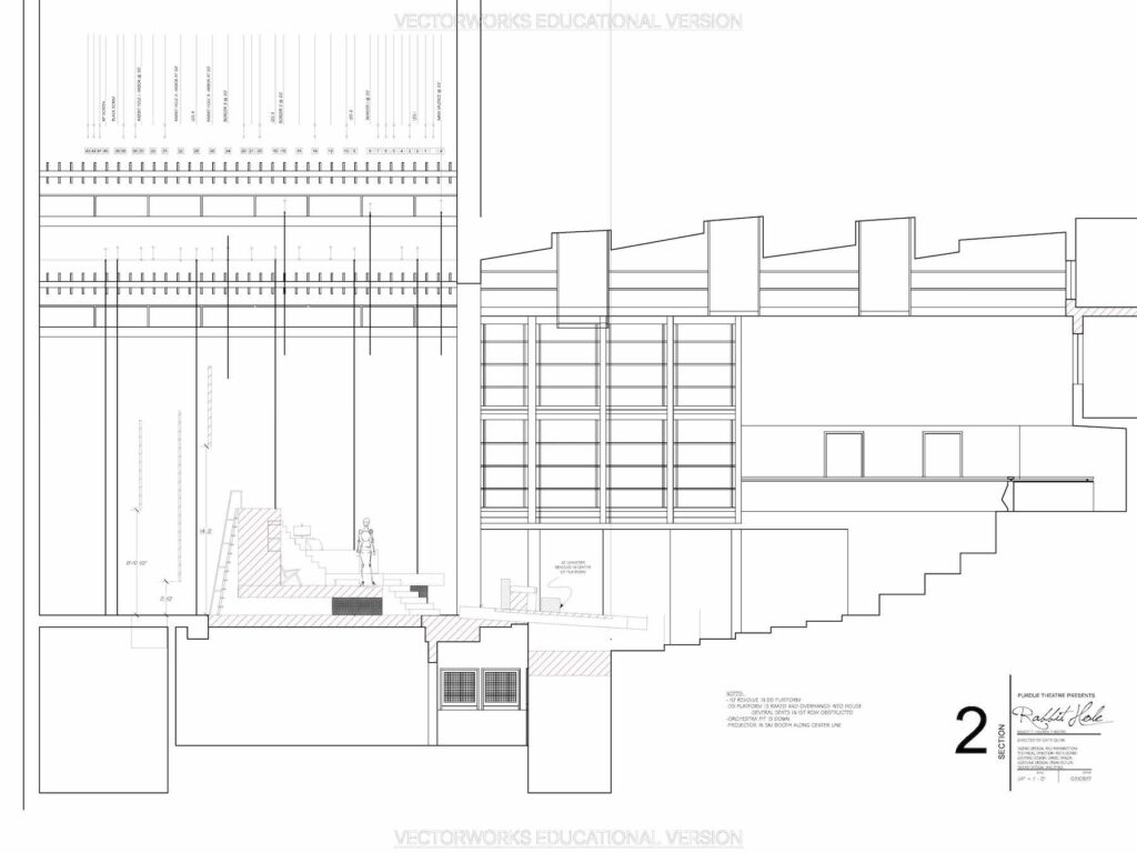
There was an overall desire from the design team to make the theatre space feel alien to our returning audience members. We sought to use the space in ways it had not been used before. The main way I accomplished this was to thrust the living room platform out into the first few rows of the audience (while also placing it on a rake and building in a revolve.
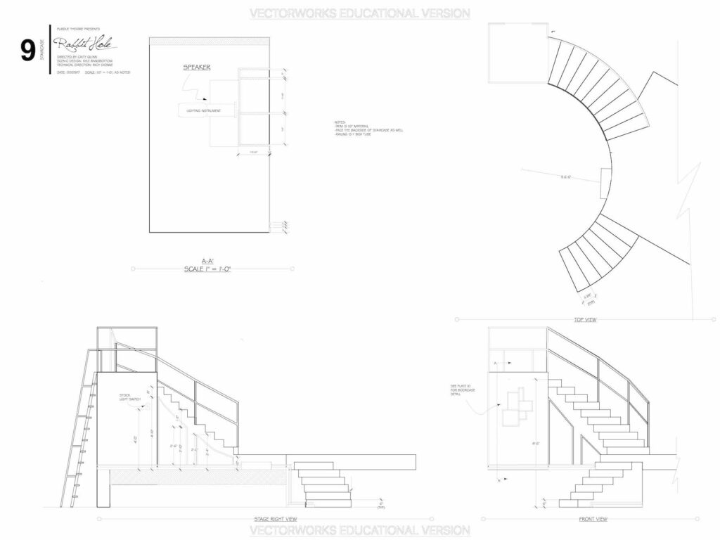
All of this evolved in mimicking the circular movement of spirals. The idea being that the ‘Rabbit Hole’ would be upstage above the set, with a curved staircase that would sweep downstage and along that movement line would continue onto the downstage living room platform.
Refining The Look
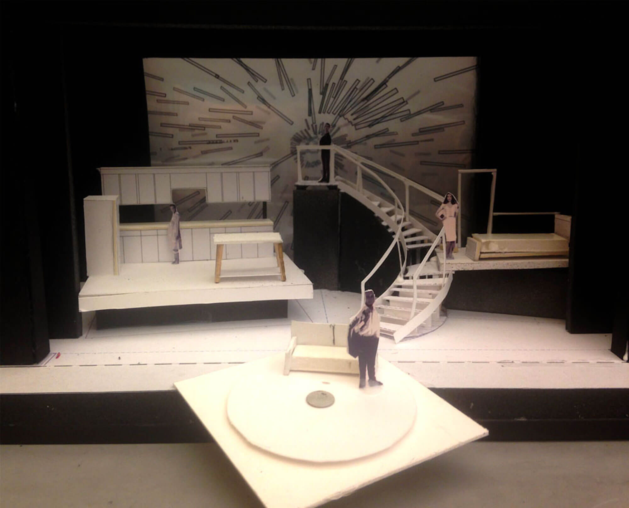
I presented a rough white model to the production team. It was a chance for the technical director to comment on the designs in terms of practicality. As you can see the set was suceeding in terms of isolation, but was difficult to manuveur.
Again, the director intended to include interludes that would include almost a dozen performers (acting as alternate reality versions of Becca and Howie) traversing the entire stage. How could we make the stage a bit more negotiable and a little less disperate.
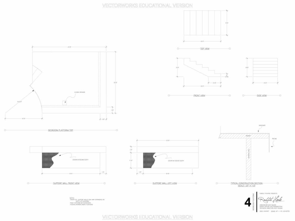
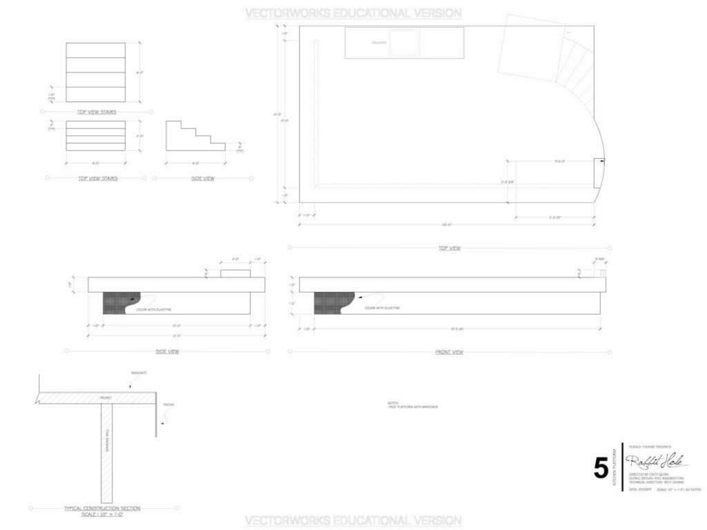
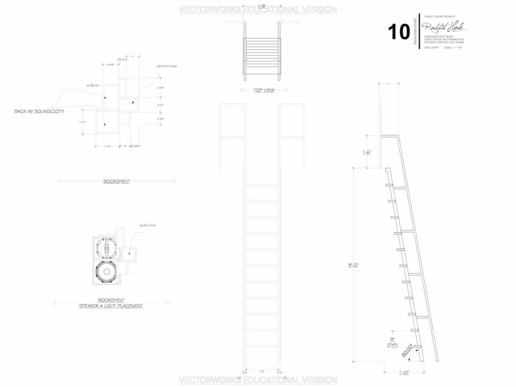
Ultimately, we decided to merge the kitchen, staircase and bedroom platforms. In order to maintain the isolation, we kept the differences in height, and cantileaverd the platforms to give them the idea that they were floating.
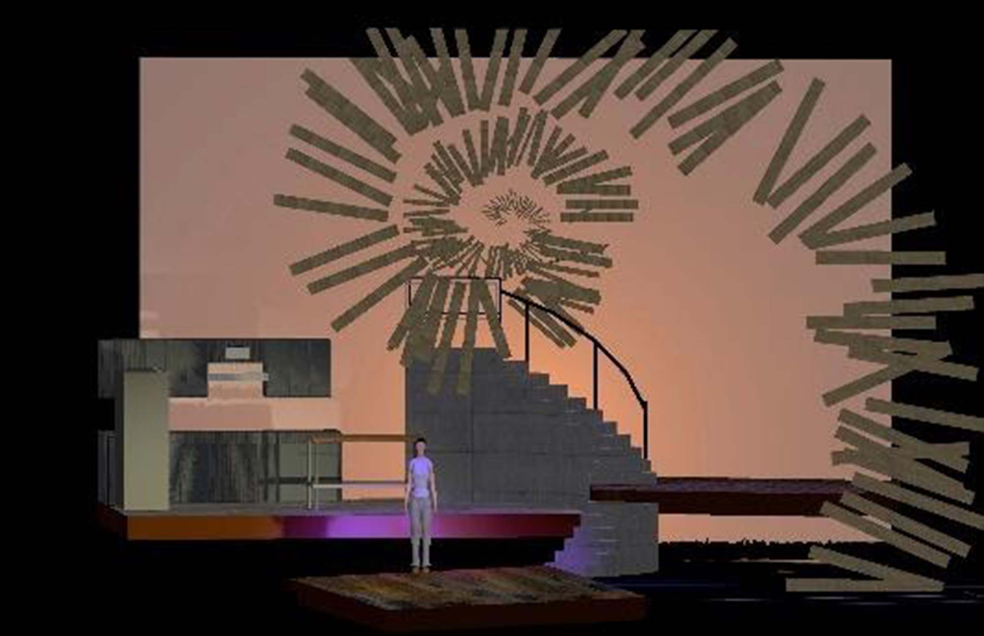
Rabbit Hole, was the first show I attempted to render in 3D. While rough, it does show this merging of the platforms. It also illustrates a concept that we considered for the Rabbit Hole itself. Essentially, we were planning on layering it on various linesets throughout the space to give the concept that it spiraled over the entire set. Ultimately, this idea was cut due to budget but did make it far into the design.
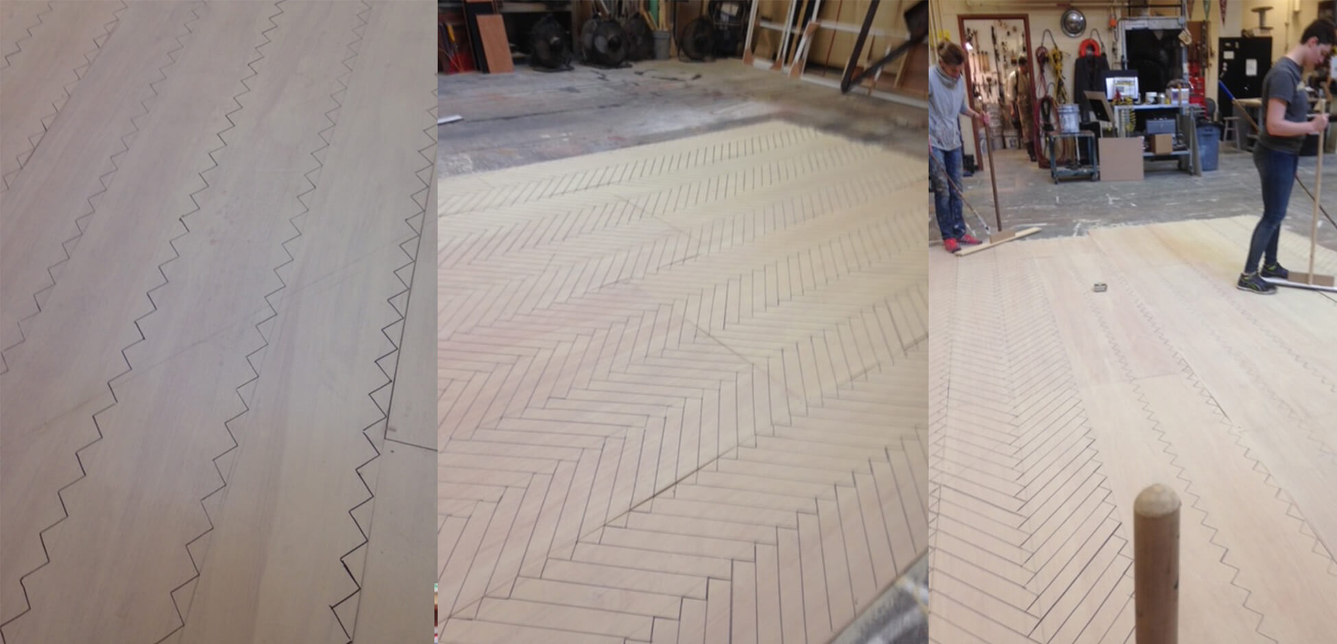
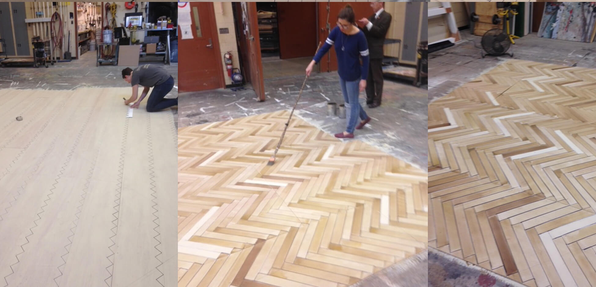
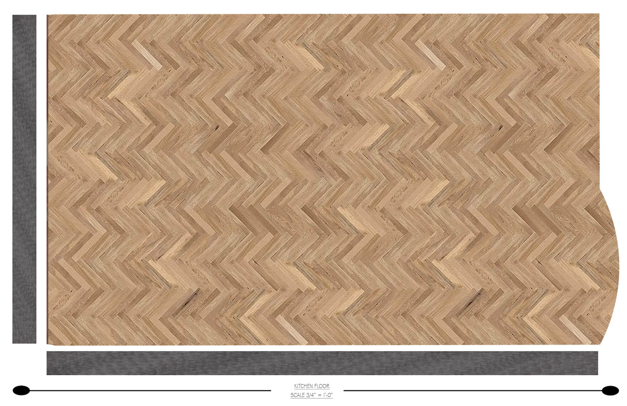
Painting the herringbone floor.
Scenic Charge Jake Wood created the process.
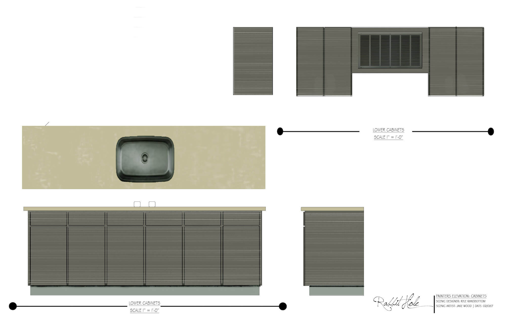
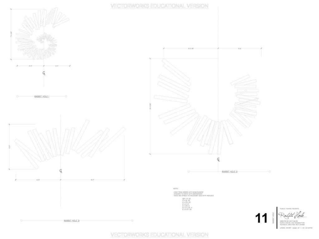
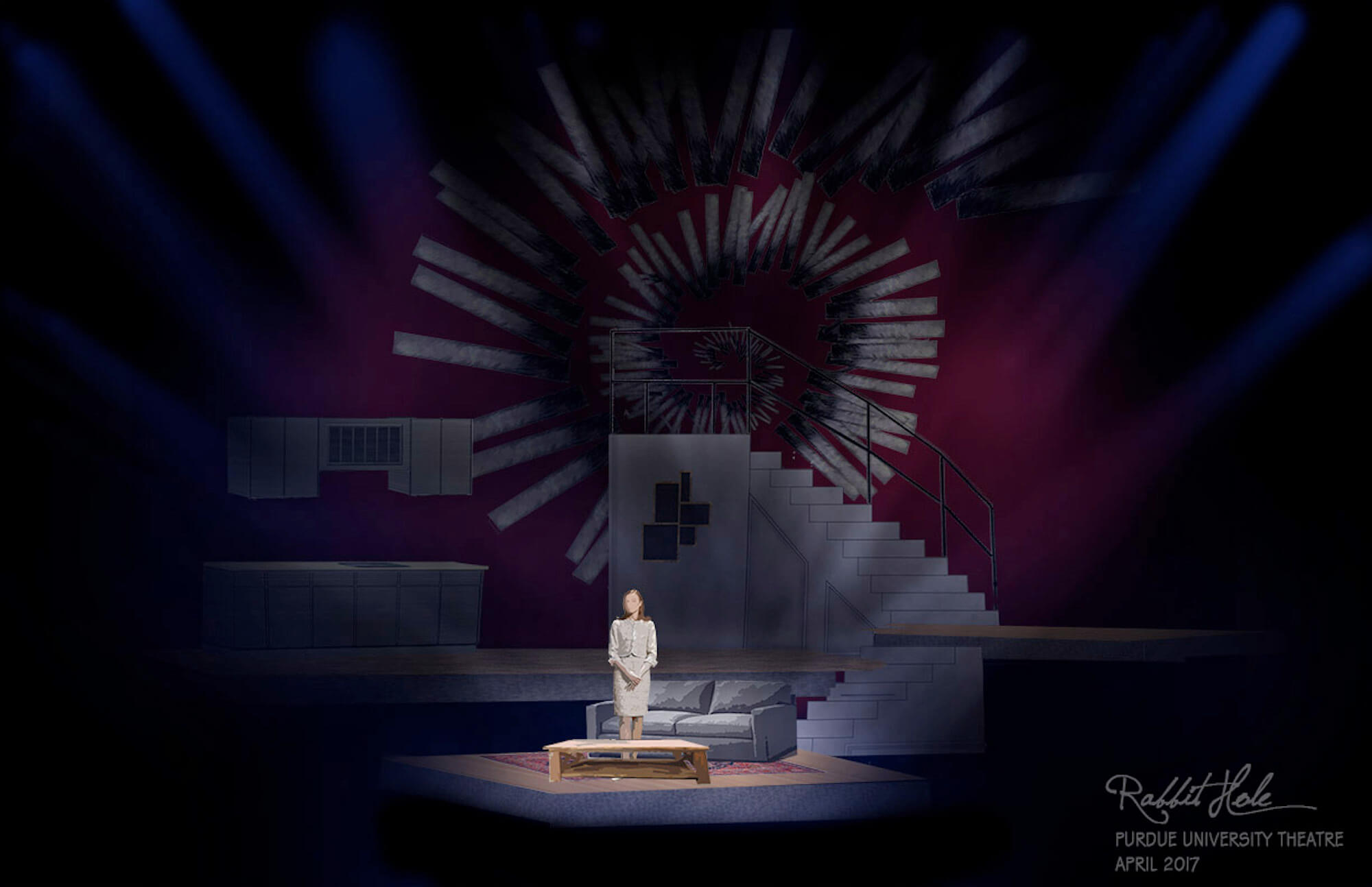
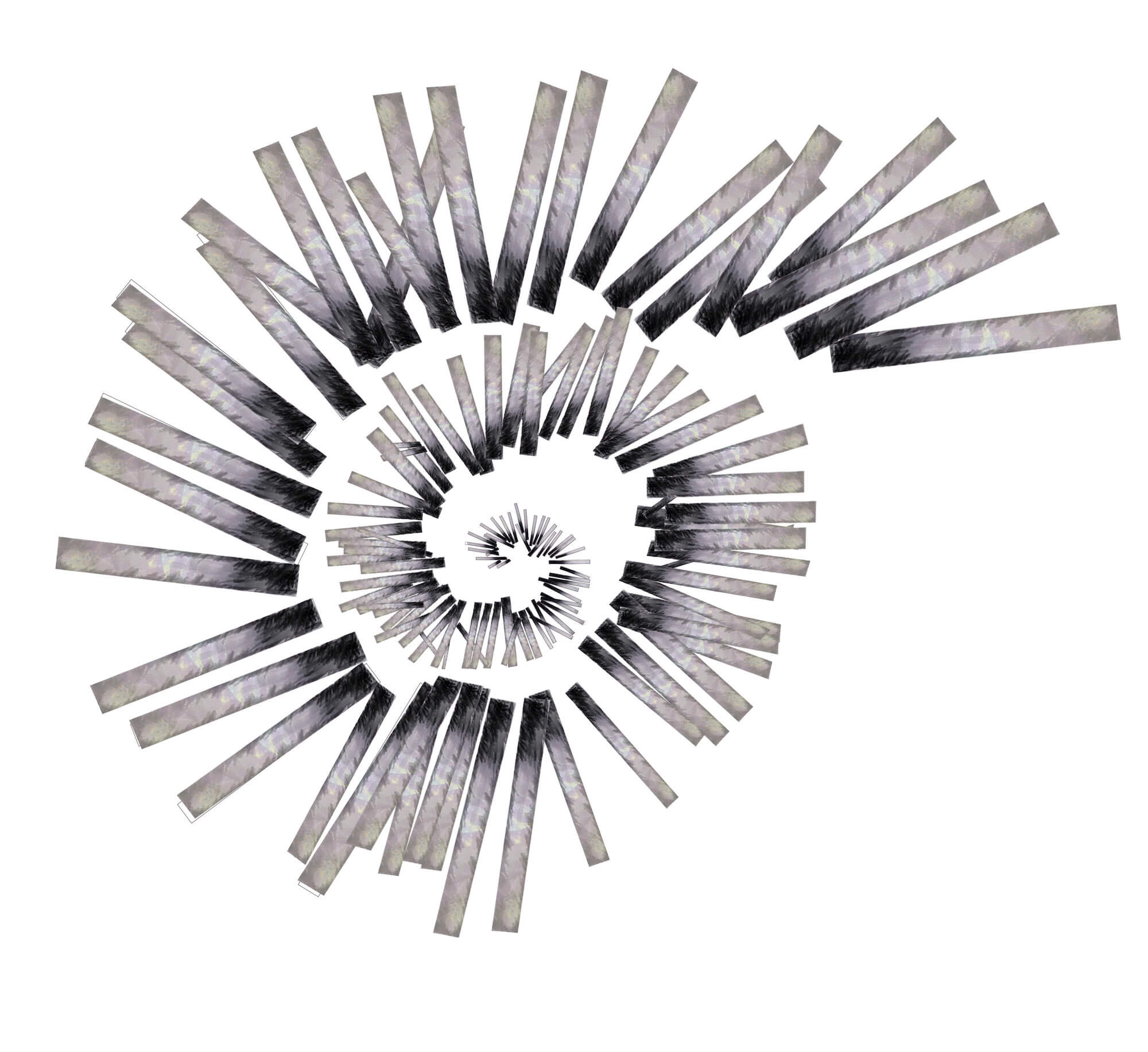
As we finalized the design and entered production, the Rabbit Hole, itself remained a rather large question. While the overall look was defined, and I had an idea to break it over a series of battens to give it a sense of depth. However, we knew it would take some development (and some faith) to actually fabricate it. I didn’t want a visible structure and unfortunately, the upstage cyc would reveal anything sturctural.
I ended up requesting that various boards be made at specific sizes (x amount at 2’x6’’, y amount at 18’’x4’’, etc). These boards were then painted and treated with a pearlecent coating to assist with the projection. I then laid these pieces out onstage and any boards that were close were attached together, giving us larger chunks to work with. I then secured monofilament at specific lengths to the various battens.
The final product was a great blend of entropy and balance.
